Tagged: Corruption
2010 BAPL UAC Predictions – AL East
For those of us here at BAPL, it’s not just how well a team plays, but how they look playing. Therefore, this year’s predictions will be based soley on the BAPL Uniform Aesthetics Council’s fashionista preferences.
We begin this week’s aesthetically clairvoyant journey in the AL East. Here’s how things will shape up in the Money Division come October, based on the scientifically proven method of Uniform Aesthetic Probability:
1. New York Yankees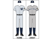
Classic and timeless, the home pinstripes and away grays are a testament to the history and majesty of this storied franchise. The Bronx Bombers don’t need a vast array of flashy “alternate” unis to encourage fanware sales…27 World Series Championships is always fashionable.
Colors (Navy Blue, White): A+ (Simple, classy)
Cap Insignia: A+ (Quite possibly the most recognized in the world)
Team Logo: B (If we must nit pick, this is our mild nit… while timeless and recognizable, it’s also mildly cheesy)
Mascot: F (Since all BAPL UAC members are natives of the southwest, we are genetically predisposed to despise the word “Yankee”. *banjo riff* )
2. Boston Red Sox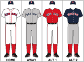
Actually, the BAPL UAC prefers the Bostons’ home and away unis to those of the Yanks (1), but the beantowners lose points because instead of sticking with the classics, they give in to the merchandising “dark side” and wear alternates on Friday nights. Additional points were deducted because the home alt jerseys are red. (2)
Colors (Red, Midnight Navy, White): A+ (Home/Away color combos are simple & classy; the road alt color combo is actually pretty slick.)
Cap Insignia: B+ (Quite possibly the second most recognizable in the world)
Team Logo: A (It really says all it needs to say, plus, we’re biased)
Mascot: B (Meh. We don’t really think of actual “socks” when we talk”Red Sox” here at BAPL, so we neither trash it or give it kudos.)
3. Tampa Bay Rays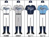
After making huge strides in 2008 both in the dressing room and on the diamond, the Rays dressing room takes a step backwards in 2010 by adding hideous powder blue alternates to their wardrobes. (3)
The Rays also lose points for failing to use their locale name on their road jerseys, i.e. “Rays” instead of “Tampa Bay” on the away grays. (See Section C, Article 135, Subsection 420 of the BAPL UAC Uniform Code for rules governing city/franchise/fandom association in road unis).
On the plus side, the Rays home unis, aways, and first alternates look great, and are leaps and bounds easier on the eyes than the grotesque fashion disaster that was pre-2008 Tampa.
Colors (Navy Blue, Columbia Blue, White, Gold): C- (Huge penalty for the 2010 use of Columbia Blue as the prominent color on the new alts.)
Cap Insignia: B- (Quite possibly the least recognizable in the world)
Team Logo: B (Crisp and appealing, but fails to induce a fan-gasm.)
Mascot: C+ (“Devil Rays” was much cooler)
4. Baltimore Orioles 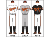
Since 2008, literal fights have broken out in the BAPL UAC War Room over who should occupy the aesthetics cellar in the AL East after reigning fashion train wreck Tampa hired an image consultant. The council is firmly divided into two camps: The Only Mix Orange and Black on Halloween Camp, and the I Can’t Believe The Toronto Brass Still Make the Jays Wear Those Hideous Powder Blue Throwbacks Camp. This year, the powder blue camp prevailed, though rumors of jelly donut kick-backs were making the rounds on the Sunday morning TV circuit. The orange and black camp has filed an appeal.
Possibly the only saving grace for the Oriole uni’s is that the orange/black affront to the senses is slightly minimized when they don the home whites and road grays…plus the road grays sport the city name “Baltimore”, not that anyone actually lives in Baltimore these days that isn’t incarcerated or at least, should be.
Colors (Black, Orange, White): F (Blatent violation of Section B, Article 2 of the BAPL UAC Code)
Cap Insignia(s): F (“O’s” and a very un-intimidating songbird? PUH-leeeze!)
Team Logo: D- (Might have warranted a “C-” if not for the stupid bird)
Mascot: F (See last two category comments)
5. Toronto Blue Jays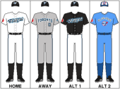
While the Only Mix Orange and Black on Halloween Camp‘s appeal is stuck in subcommitee, the I Can’t Believe The Toronto Brass Still Make the Jays Wear Those Hideous Powder Blue Throwbacks Camp is partying like it’s 1979. The O & B Camp’s main argument is that the Toronto should not occupy the cove
ted AL East Worst Dressed cellar-dweller position based solely on the repulsive powder blue throwbacks. After all, the road grays have the requisite city name across the chest, the home whites are fairly pleasing, and the alternates do not even come close to the eye-vomit inducing alternates of the Orioles. Methinks the Jelly Donut Lobby is at work behind closed doors of the BAPL UAC subchambers.
Colors (Blue, Black, Graphite, Silver, White): B– (WTF is “Graphite”? Must be a Canadian thing.)
Cap Insignia(s): B (Actually, not too horrible, the O & B camp may have been wronged)
Team Logo: F (Sure, it includes the acceptable cap insignia, but the added appendage just screams “We’re really, really trying to look cool and fit in”, not unlike baseball in Canada.)
Mascot: F (What is with the mascot selection for Toronto sports teams? Blue Jays? Maple Leafs? Raptors? Ok, “Raptors” might be cool for the NHL, but not the NBA. The only cool sounding mascot in Toronto belongs to their CFL team, the Toronto Argonauts, whatever the fk an “Argonaut” is…effing Canadians.)
—
This just in: the Friends of Focused and Relevant Baseball Blogging Group has just successfully lobbied for an Actual BAPL Predictions rider to be appended to each UAC Predictions Resolution. See below.
—
Actual BAPL Predictions for the American League East as mandated by BAPL UAC32910:
AL East
1. New York Yankees
2. Boston Red Sox
3. Tampa Bay Rays
4. Baltimore Orioles
5. Toronto Blue Jays
(Naturally, this matches the original UAC Predictions anyway. Effing lobbyists.)
Next up: the NL East.
–Jonestein
(1) Full disclosure – the BAPL UAC is chock full of Red Sox supporters.
(2) The BAPL UAC is repulsed by unis
that prominently feature the color RED. Red is acceptable as a
highlight color only, and ONLY when it doesn’t clash with a unis
primary colors or cause seizures.
(3) The BAPL UAC frowns heavily upon
teams taking the field in powder blue. However, powder blue is
nostalgically acceptable in the fanware department, except for maybe
the Blue Jays powder blues…we’ll get to them next though.
Note: For those of you out there that share the BAPL Uniform Aesthetics Council’s weird obsession with uniform aesthetics, be sure to check out the Uni Watch site.
Images swiped from team pages on Wikipedia.
